MockupUI Tutorials
Prototyping user interfaces with MockupUI
This step by step tutorial provides a quick introduction to MockupUI. You will learn how to create a desktop application mockup, how to add windows, widgets and annotations and how to generate a UI specification document.
In this tutorial we will create the user interface mockup for an Address Book application. It will have four different screens:
The application's Main window
Create Contact
Edit Contact
Remove Contact.
1. Download and install MockupUI
The installation package can be obtained here. Follow the installation steps and start the application.
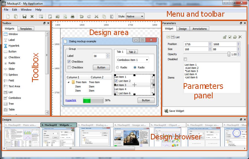
2. MockupUI editor overview
The MockupUI user interface is composed of five main sections:
The Menu and toolbar which allows you to create, open and save a MockupUI project or to export or print designs.
The Toobox panel contains the MockupUI's mockup designing tools:
Widgets: The available UI and graphic widgets that you can use to create mockups.
Templates: The designs or customized widgets that you saved as templates.
The Design area you can preview the currently selected screen. It is also where you can visually insert and edit widgets.
The Parameters is where you adjust the properties of the widgets, manage their order and annotate designs.
Widget: The Widget tab shows the parameter editor of the currently selected widget and it allows you to change the widget's geometry, content and formatting.
Design: The Design tab allows you to hide, lock, reset or remove a widget and to manage the order of the widgets.
Annotations: The annotations tab allows you to add descriptions and notes to your designs.
The Design browser is where you browse and select the design that you want to work on.
3. Creating the main window
Let's begin by creating a new design where we will mockup our main window. To do this, select File >
New Design or click the New Design tool button to create a new screen and set the window name to
"Main Window". Now you can see a new design is created and shown in the design browser.
Add the Window widget
We need to add a window widget to with the title "Contact manager". Do this by dragging the window widget from the toolbox panel and dropping it on the design area. Feel free to resize the window widget until it is visually appealing to you. You can also resize the window widget by giving it a specific desired size under the widget area of the parameters panel.
Design the menu bar
By default, the window widget has a menu bar with some menus in it. Let's edit this to fit our requirements. Select the window widget in the design area and go to the Widget tab of the parameters panel, and edit the menu bar of the window. Delete everything and add the following items:
- File, Edit, Tool and Help.
In order to achieve this, you could also just delete "Window" from the already existing list since the others are already what we need.
Now let's add a Menu widget under the File menu that shows the following items:
- New address book
- Print Contact
- Print Address Book
- Add contact
- Edit contact
- Delete contact
- Quit
Drag the menu widget from the toolbox panel unto the design area and place it under the file menu. Then edit its content by adding the list above in the values section of the parameters panel.
After adding the Menu widget for the file menu. We will need to hide it away for now while we add the other widgets. To do this. Go to the design tab of the parameters panel and uncheck the checkbox for the menu item. It is also advisable to rename the item so that it will be easier to distinguish it from others as we add more items. To rename an item in the design tab, just right click on it and select rename. Then give it the desired name in the pop up box and click ok.
Add more widgets to the main window
To find out more about the available widgets in MockupUI visit http://mockupui.com/documentation/reference/ui-widgets.html.
Now let's add a toolbar to our mockup with the following editing buttons: - New Contact - New address book - Edit contact - Remove Contact
To achieve this we will use a rectangle widget from the toolbox and four button widgets. Remember to name each widget accordingly in the parameters panel. Your end result should look like the image below.
Let's add a search text Field in the toolbar. Select the Field widget from the toolbox and drop it on the right corner of our recently added toolbar. Give it the text "search" in the parameters panel.
Now let's add a Tree widget to the left side of the main window that will display the available address books. Drag, drop and resize the Tree widget to fit conveniently on the left side of the main window. Then go to the parameters panel and add the following text for the address books:
- Address Books
- All contacts
- Family
- Friends
- Colleagues
- Personal
- Work
- Travel.
Enter the above items one after other in order to have four separate address books. The first Item represents the title of the Tree widget. It is possible to add additional columns to the Tree widget by separating the text for each column with commas. Also, indenting a particular entry with a single space makes it a sub branch of the previous on the tree. You can use "+" before a name to add a checked checkbox, or "-" to make add an unchecked checkbox.
Let's add a central Table widget displaying some demo contacts and their addresses. It should have the following columns: Name, Address, Phone, Email, Website and Select (column containing the checkboxes). The content of the table is edited in CSV format (one line per row with comma separated values). The first line sets the header of the table. Check out the documentation page for more information.
4. Design dialog windows
Now let's add dialog windows for contact editing operations (create/ update contact/ delete
contact). First let's design the create contact dialog. Add a new design by selecting new design
from the file menu and name it create contact drag and drop the various widgets necessary to
create the UI shown below. Drag and drop Field widgets for each field you want to add: Name,
Address, Phone, Email and Website. Add Save and Cancel buttons.
Duplicate above design by right clicking on the design in the Design browser and choosing duplicate. Then rename the duplicate to "Update contact". Add demo content to the fields to make the mockup easier to understand.
Now let's add a dialog to prompt the user when he/she tries to remove a contact. Make sure to check the disable checkbox in the parameters panel for each Field Widget so as to give the mockup a realistic feel of un-editable text fields.
5. Write explanation notes for each screen
MockupUI allows you to add descriptions and notes for each screen. Open the Annotations tab and add a description and notes that explain the screen and the possible actions in that screen.
Add Explanations of the available actions in the main window. Open the Annotations tab and fill the two text boxes:
Description: A short text that describes the screen for example for the main window. Such as: "This is the main window of the application. It displays the list available address books and the contacts in the currently selected address book. It allows you to create or remove an existing address book and to add, edit or delete a contact."
Notes: Explain what users can do in this main window. Add text explaining all the available actions. Like this: "Creating a new contact: click the Add contact menu item to activate the contact editor. Fill the name, address, phone number, website and email fields and click OK. This will save the new contact to the database and will make it visible in the Contacts table." "Creating an address book: Click on the "new address book" button in the toolbar and enter a name for the address book in the pop up window that will appear then click ok to save the address book."
6. Choose Native or Wireframe visual style
Up till now we have been designing or mockup using the native style. MockupUI allows us to also use the wireframe style for our mockup and it is very easy to switch between each style. Select the style you want from the Style drop down list. This will change the appearance of all the screens in the project. Native operating system style Wireframe style for low fidelity prototyping
7. Generate the UI specification
by clicking the "Export Document" from the File menu. In the export document dialog, you can choose the document title, the output file format (docs, pdf or html), the page size, orientation, and page margins. Click OK to start exporting.
The generated document will contain the screenshots and the explanations (Description and Notes) you've entered in the annotations tab Check out the online help to learn about the available exporting options
More help
Need more help with the MockupUI?
Ask a question through the support form.
Also check our FAQ - they may provide a solution immediately.